Podere Ortica
Packaging
Illustration
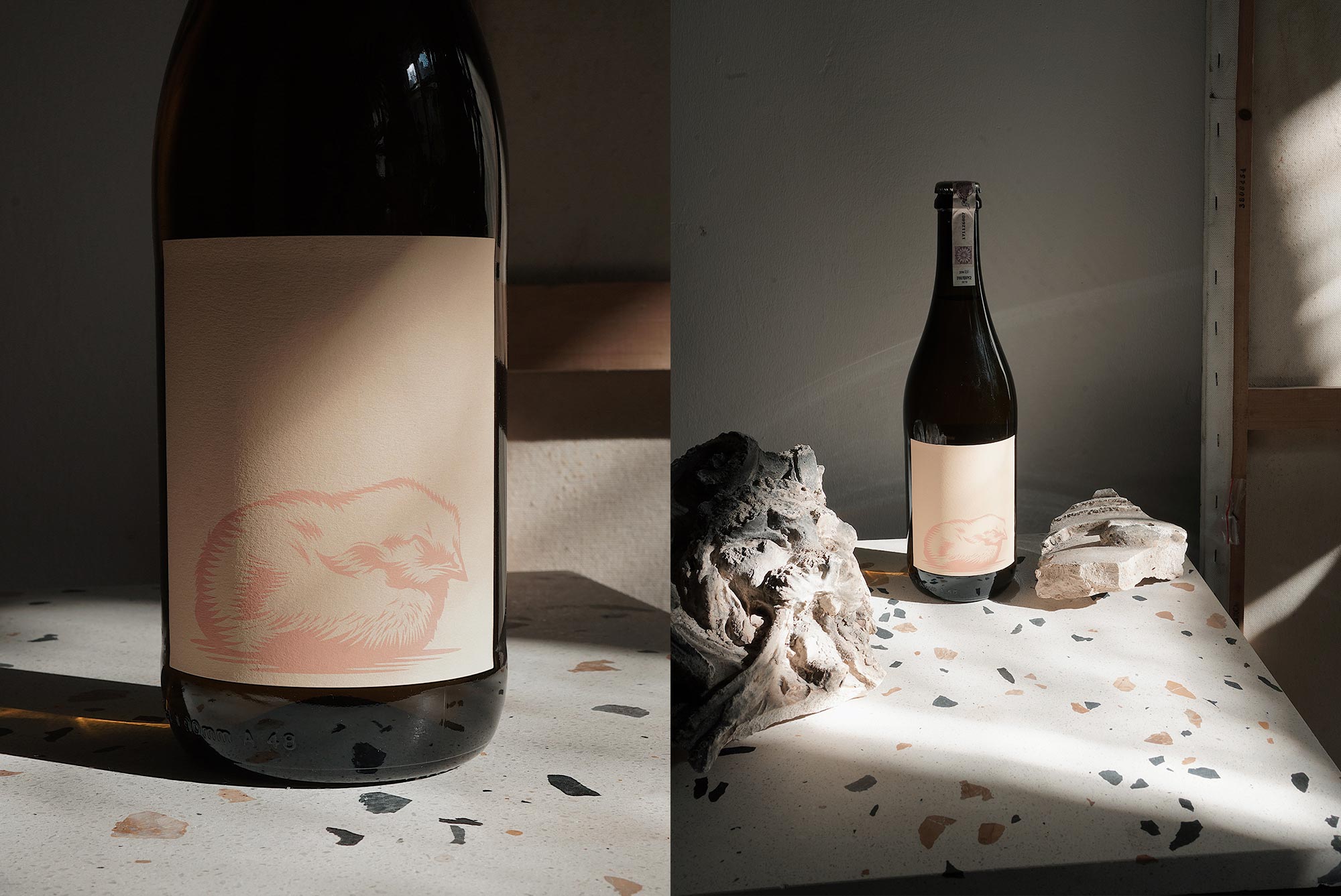
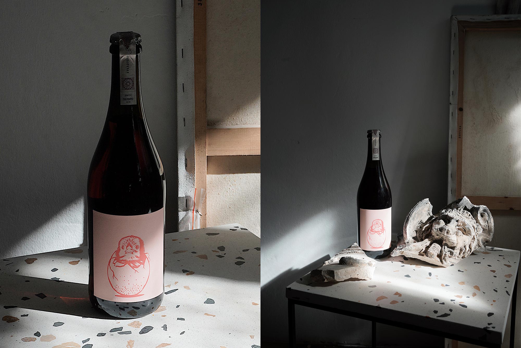
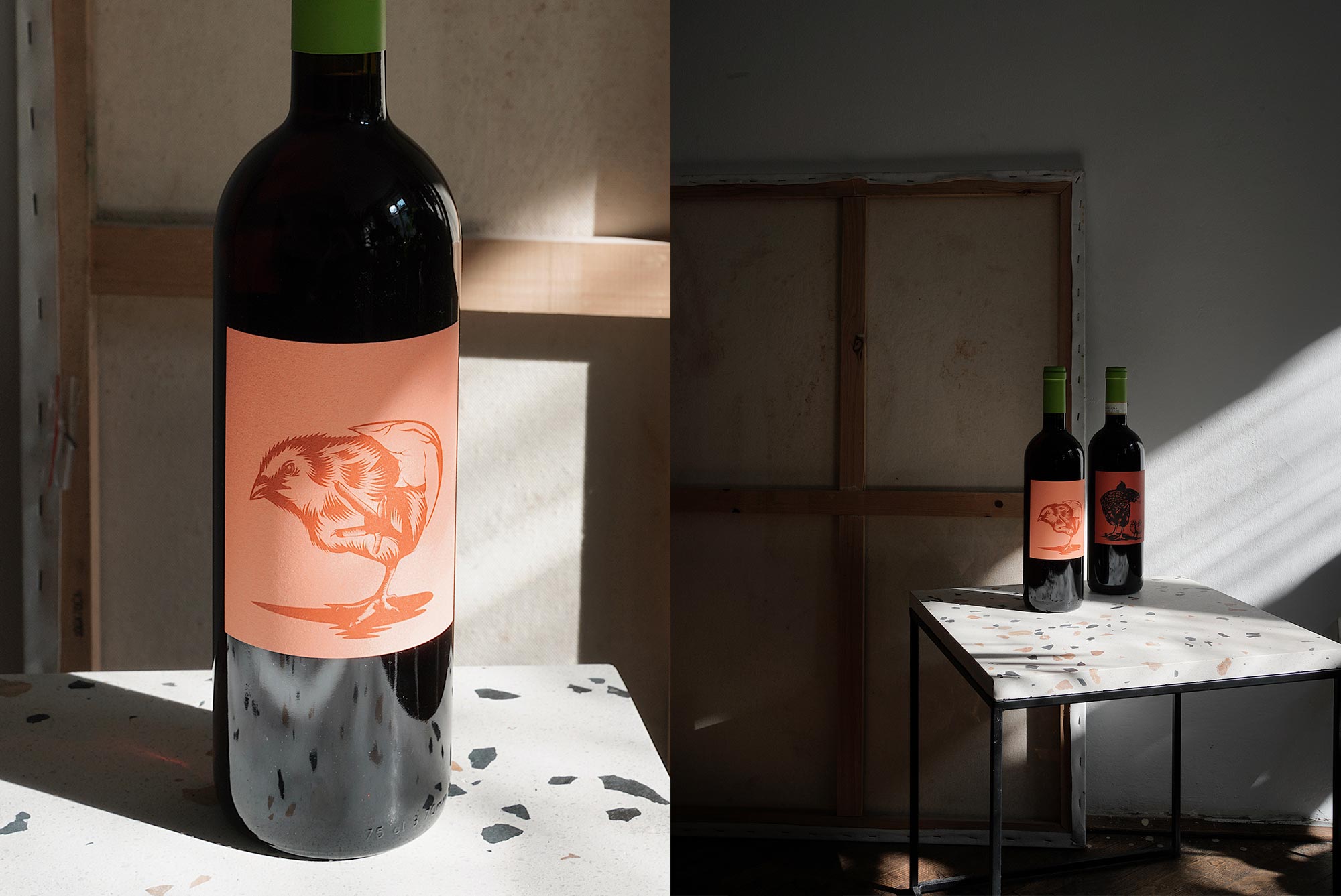
Labels design for Tuscan vineyard Podere Ortica.
The illustrations of hen and chickens are an allegory of the history of the Podere Ortica vineyard. The owner, Francesca Bidini, named each wine after her children:
Ade (daughter Adele) Bianco ,
Ago (son Agostino) Rosso,
Agade (Adele and Agostino) Rosso
and last but not least:
Red wine with the whole family on it: Ati (Etruscan word for mother) Chianti
The motif of a hen and children is also a direct reference to the wines of the Chianti region, whose symbol is the rooster. However, we chose the chicken motif to emphasize the family bond and the fact that the vineyard is managed by a woman.